#6 - Detect Outliers Like a Detective
Techniques of detecting outliers in the data


Outliers - In a Nutshell
In order to understand what an outlier is, we can think of a great example that explains the concept in a nutshell. Imagine, there is summer season going on. You are with your friends chilling. Everyone in your group is wearing normal clothes (light clothes that people usually wear in the summer season) except for the one who is like a weirdo. That single person is wearing a sweater. Now clearly, he/she is totally a different person who is not like the rest and certainly, he/she doesn't fit in your group.
The explanation can be clearly understood by seeing the cover image of this article.
Credits of Cover Image - Photo by Will Myers on Unsplash
Question in your Mind
Wait a second. Let's say I have numerical data, how can I be a detective to catch hold of an outlier in my data? Obviously, the data will be not like the cover image. (dang it)
In that case what should I do? (double dang it)
Answer to Your Question
Yes, what you are saying is absolutely logical. In order to detect the outlier in numerical data (or any data for reason), we can use various statistical methods that help find out the outlier.
Definition of Outlier - Statistical term
In statistics, an outlier is a data point that differs significantly from other observations. An outlier may be due to variability in the measurement or it may indicate the experimental error; the latter are sometimes excluded from the data set. An outlier can cause serious problems in statistical analyses.
There are 3 easy ways to detect the outliers within the data.
- Visual Exploration
- Scatter Plot
- Box Plot
- Z-score Method
- IQR - (Inter Quartile Range)
Note - The readers of this article are assumed to know basic statistical measures and how to calculate them. If yes, you can proceed further. Otherwise, you may want to refer to this article.
Outliers can occur due to the wrong entry of the data or typo into the original dataset. Now that we know different ways of detecting, we shall understand each with an example.
Dummy Data
Let's have data values say -
$$x = [10, 14, 15, 12, 18, 20, 19, 17, 22, 25, 80, 21, 25, 24, 13]$$
and
$$y = [13, 24, 17, 22, 26, 21, 14, 11, 10, 19, 23, 27, 11, 15, 85]$$
Necessary Imports

1. Visual Exploration
By representing the data in the form of a graph, one can easily identify the variability or the difference in data patterns that may lead to having an outlier. The visual representation is not more effective than the other two methods.
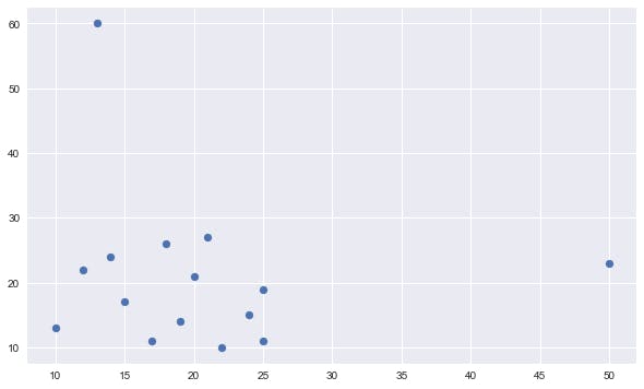
Scatter Plot
Scatter Plot basically plots or visualizes the data along the coordinate axes based on the scale range mentioned.
Code
Output
Box Plot
Box plot basically plots or visualizes the statistical measures of the data. The outliers are automatically shown either side min and max values. This is more robust than the scatter plot in detecting the outliers. The explanation of the box plot is below.
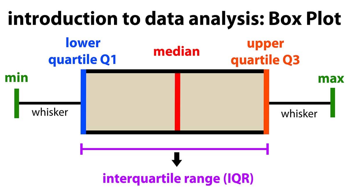
Credits - The above image is taken from the Internet.
Code - x

Output - x
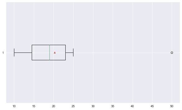
The point (50) outside the max line is an outlier.
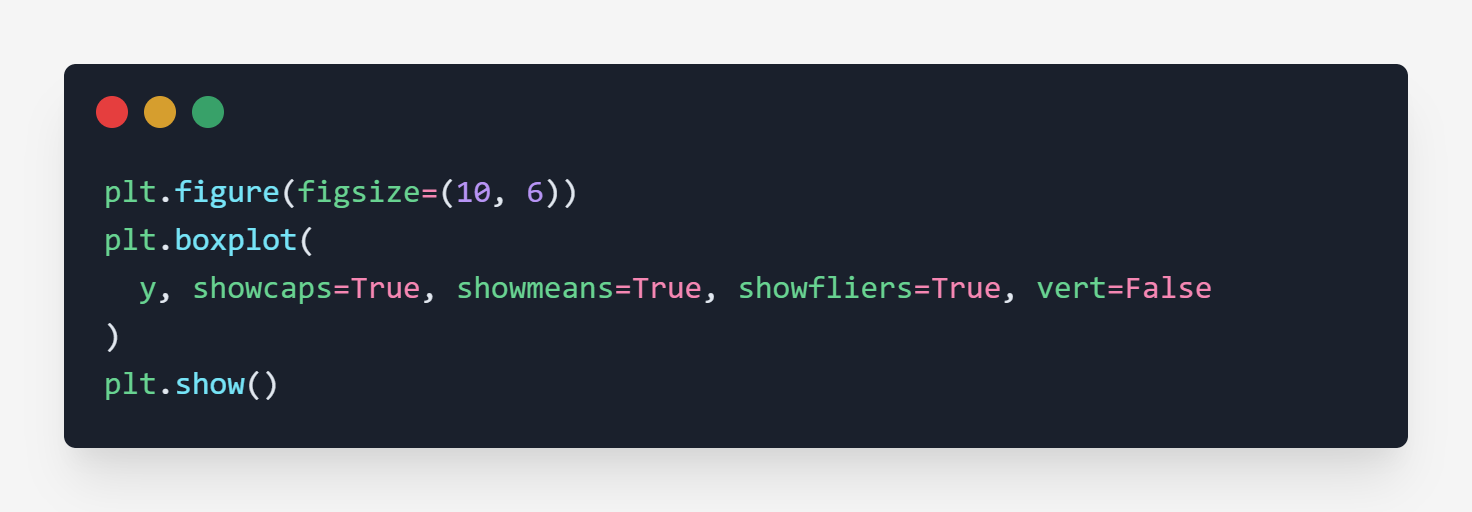
Code - y
Output - y
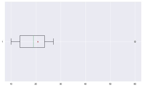
The point (60) outside the max line is an outlier.
Dang you (back)
2. Z-score Method
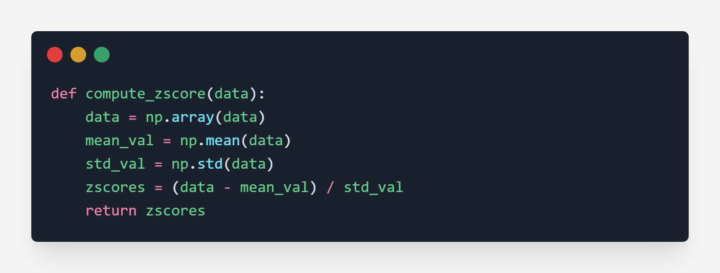
The Z-score method is used to normalize (standard normalize) the data. The normalized data is also called Standardized Normal Distribution. One important thing about this is that the mean is always 0 and the standard deviation is always 1.
Formula
Let
$$X = [x_1, x_2, x_3, \dots, x_n]$$
and
$$\mu_x \rightarrow \text{Mean}$$
$$\sigma_x \rightarrow \text{Standard Deviation}$$
then
$$z_x = \frac{(x_i - \mu_x)}{\sigma_x}$$
When we compute the above, it generates a sequence of numbers that are mostly normalized (standardized) values.
- If any value is greater than
+3is an outlier. - Similarly, if any value less than
-3is an outlier.
Code
The above code returns a sequence of normalized values.
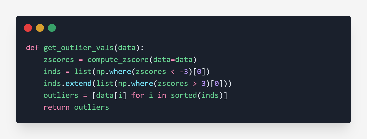
The above code returns the outliers from the original data by getting the indices.
Testing
The above result is clearly stating that 50 and 60 are outliers of x and y.
Double dang you (back)
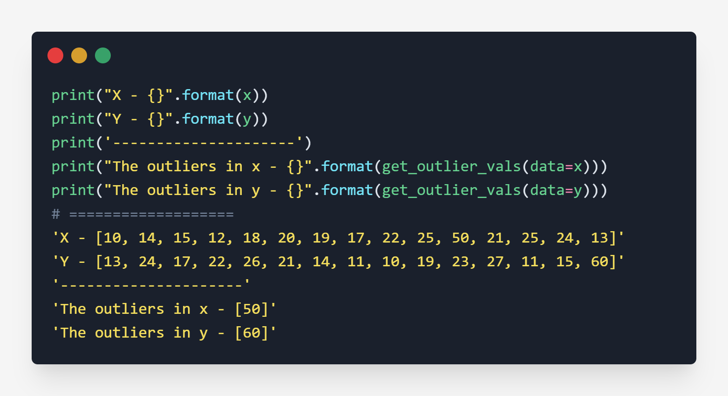
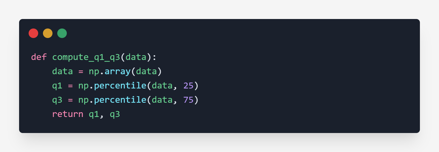
3. IQR - (Inter Quartile Range)
IQR is self-explained by just looking at the box plot chart. The formula for IQR is
$$IQR = Q_3 - Q_1$$
where
$$Q_1 \rightarrow \text{First Quartile}$$
$$Q_3 \rightarrow \text{Third Quartile}$$
and
$$Q_2 \rightarrow \text{Median}$$
Code
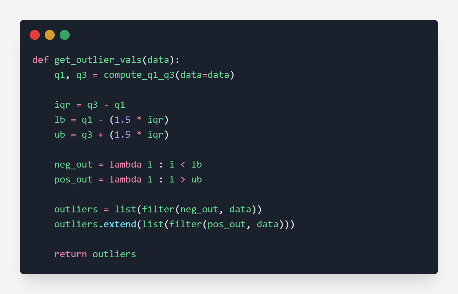
Once we compute IQR, we need to find the bounds, i.e., upper bound and lower bound. We use a constant (1.5) to get the bounds.
- The data point which is less than the lower bound is an outlier.
- The data point which is greater than the upper bound is an outlier.
Code
Testing
The above result is clearly stating that 50 and 60 are outliers of x and y.
Triple dang you (back)
Hence the Questions are answered. You have now successfully become the detective who can detect the outliers in the data.
Well, that's all for now. This article is included in the series Exploratory Data Analysis, where I share tips and tutorials helpful to get started. We will learn step-by-step how to explore and analyze the data. As a pre-condition, knowing the fundamentals of programming would be helpful. The link to this series can be found here.