

South Africa - Crime Data Visualization
Interactive maps with Python and Geemap


Introduction
SAPS (South African Police Service) has provided crime data via Kaggle which contains the history of crime statistics from 2004 to 2015 per province and station in South Africa. The dataset contains a set of shapefiles and CSV files.
Data Source → kaggle.com/slwessels/crime-statistics-for-s..
Let's see if we can generate an insightful analysis and report using this data by leveraging Python and Geemap for this project.
Credits of Cover Image - Photo by Simone Busatto on Unsplash
Implementation
We will analyze the data fully using Python. To do so, we begin with importing necessary packages.
If you are interested in watching the video explanation, then the below is for you.
import Packages
We are going to use certain packages like geopandas, geemap, etc to read data from shapefiles easily. We will need to import this along with some additional packages.
Earth Engine Initialization
The next step is to initialize the earth engine module. We do this in order to visualize the spatial data integrating with geemap.
(You will need to authenticate the earth engine package after signing up on the Google Earth Engine website).
Geocoder
In order to load the map centering the South Africa or the province of South Africa, we need a location. For that purpose, we require a geocoder to avoid hard-coded coordinate values.
(To know more about OpenRouteSerivices, you can refer to this blog).
ORS Token
Location Fetcher
South Africa location
Data Loading / Reading
The dataset contains two CSV files and one shapefile. We can load CSV files using pandas and shapefile using geopandas or geemap.
The sizes of the data can be known using the shape attribute.
String data manipulation can be done with the apply() method.
In order to analyze the data per each province and district, we also need some additional data (shapefiles) which we can easily obtain from diva-gis.org. Because we need South African states and districts, we can simply search for that to get the shapefile data.
Exploratory Data Analysis
Since South Africa contains 9 provinces, we can graph a bar chart to visualize the population data of each province.
We can also directly visualize the population data on the map in the form of a choropleth map. We can leverage geemap to get an interactive map plot. For that, we first need to merge sa_states with popn_province_df.
Choropleth Map of Population
In the above map, the darker region indicates the higher population and vice-versa.
The list of the total number of crime categories.
If we want to know the number of cases reported in each station for a selected crime category and year belonged to a particular province, then we shall have a function wherein we can pass the inputs and get the result accordingly.
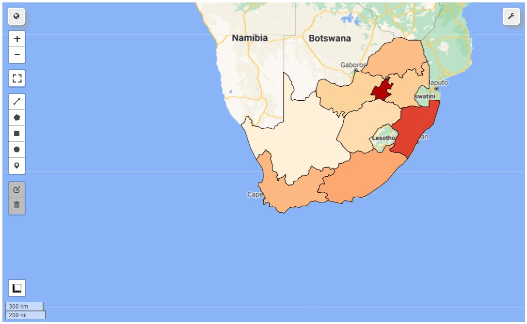
Murders in the year 2006 at Western Cape
Murders in the year 2010 at Eastern Cape
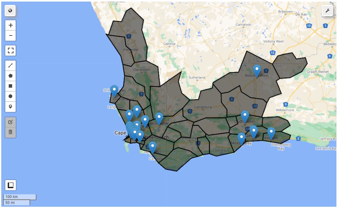
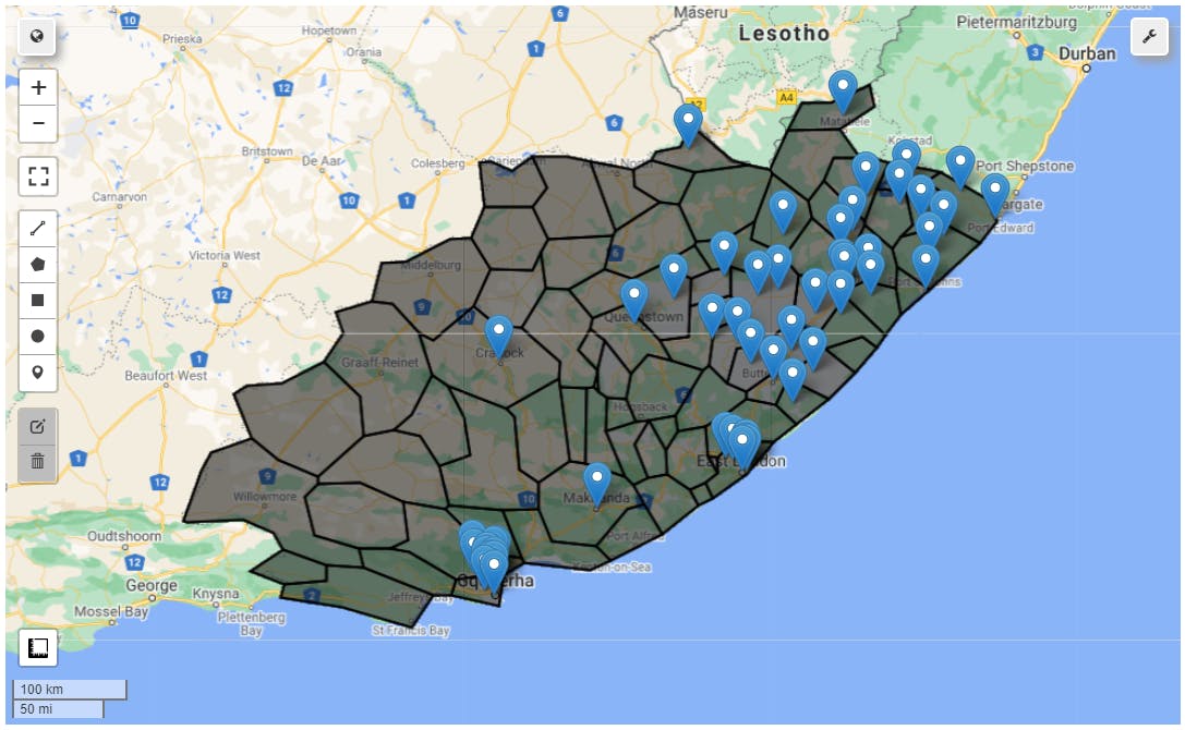
Mapping Stations per district at a selected province
We can also plot the stations where the crimes are reported. We can show that per each district of a selected province. The following function helps us achieve that.
Murders reported in the year 2006 at the stations of Western Cape
Murders reported in the year 2010 at the stations of Eastern Cape
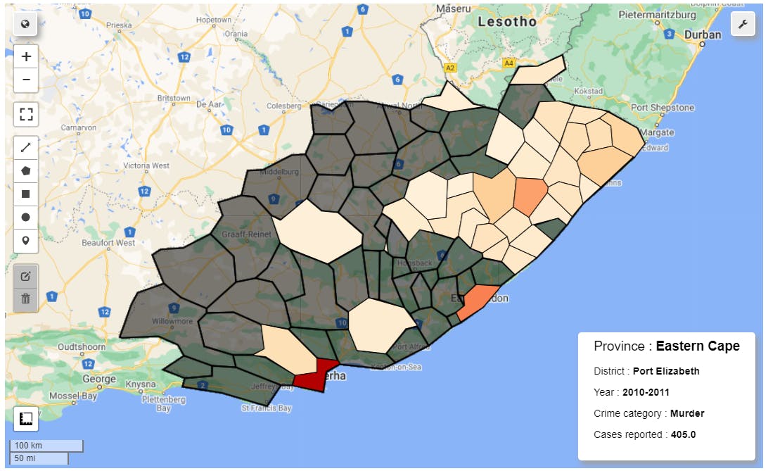
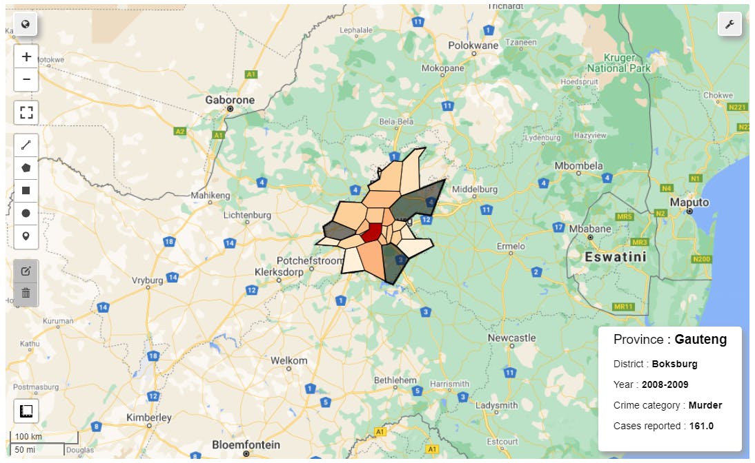
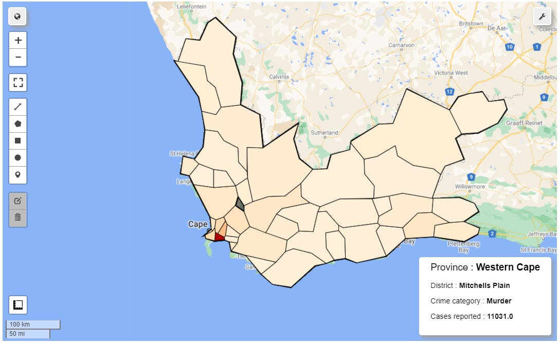
Choropleth Map of Districts
As a matter of fact, we can also plot a choropleth map with respect to total crimes reported in a selected province in each district irrespective of the station that the crime has been reported. This is done by filtering the data based on the year that is passed.
We will incorporate some amazing functionalities of geopandas such as spatial join.
(More details about spatial joins will be explained in the coming posts).
Murders in the year 2010 at Eastern Cape
Murders in the year 2008 at Gauteng
If we explore the first five rows of the crime data, we can see that it contains years as columns.
We shall sum all the years' data column-wise to end up having total crimes being reported per station. Using this, we can plot a choropleth map (of a different kind) based on province and districts. Again, we will incorporate spatial join techniques for district-wise visualization.
Total Murders at Western Cape
We can change the parameters in every function to get the result according to the province, year, and crime category that are passed.
You can find my notebook with the full code here.
Well, that's it for this article, you can subscribe to my newsletter for such exclusive content. Thanks all.