#4 - Identify Patterns in the Data
Recognize patterns in the data to draw conclusions


Introduction
Identifying Patterns helps us understand more about the data, which is gaining insights by observing trends and patterns. This also helps in finding the relationship between the two sets.
From the business point, observing trends really helps in tracking the overall sales and returns. Providing the data stored yearly-wise, we can easily plot and identify a trend pattern - an upward trend or constant trend or a lower trend. And thus, decisions are made based on facts.
Google Trends is one of the best applications available on the web to see the trend graph on the search term.
Credits of Cover Image - Photo by Clark Van Der Beken on Unsplash
Different Ways of Identifying Patterns
Depending on the data we can gain insights either by just looking at the tabular data (assuming data is in tabular format) or plotting it.
From a personal point, it is always good to visualize the data in order to properly identify the patterns. This really makes sense to me.
Let's try to identify patterns in one dataset.
Note - Throughout this series, we will be dealing with one dataset originally taken from Kaggle.
Hands-on Practice
For the hands-on practice, we will use a dataset in the domain of health care on heart attack possibility.
Let's get started ...
We are using Python and specifically Pandas library - developed with a clear intention to approach the key aspects of data analytics and data science problems.
Installation
pip install pandas --user
pip install numpy --user
pip install seaborn --user
pip install matplotlib --user
The above installs the current version of packages in the system. Let's import the same.
import pandas as pd
import numpy as np
import seaborn as sns

from matplotlib import pyplot as plt
Load / Read
In order to load or read the data, we use the read_csv() method where we explicitly tell Pandas that we want to read a CSV file.
df = pd.read_csv('heart.csv)
Since df is a Pandas object, we can instantiate the other methods that are made available to understand the data.
From the last tutorial, we know that cp (chest pain), thalach (heartbeat rate), chol (cholesterol) (not so important), and slope are happened to be the most important features.
Divide the Data by target
Display the list of columns in the dataset.
>>> df.columns
Index(['age', 'sex', 'cp', 'trestbps', 'chol', 'fbs', 'restecg', 'thalach', 'exang', 'oldpeak', 'slope', 'ca', 'thal', 'target'], dtype='object')
Filter the dataset considering the target variable.
df_1 = df[df['target'] == 1] # data of people who are risky
df_0 = df[df['target'] == 0] # data of people who are safe
The cholesterol is measured in milligrams (mg) and the heartbeat rate is measured over a minute. Let's plot the [chol , thalach] features with respect to age for both df_1 and df_0.
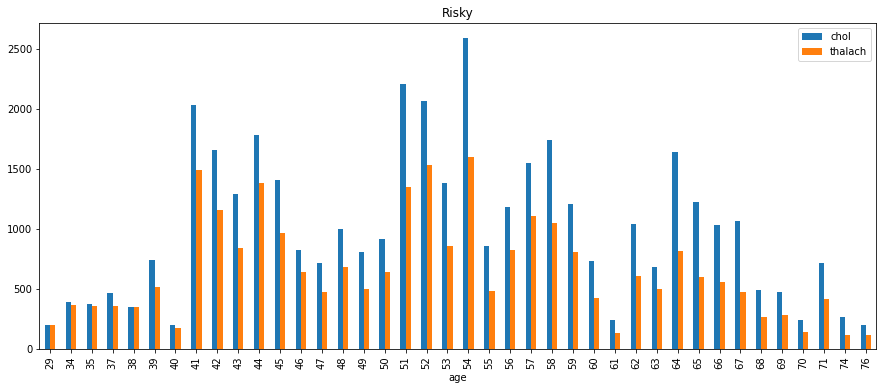
Age group - Risky
- First group the data (
df_1) byageconsidering the columnscholandthalach.
ag_df_1 = df_1.groupby(by=['age'])[['chol', 'thalach']].sum()
- Plot a
barchart for the grouped data (above).
ag_df_1.plot(kind='bar', figsize=(15, 6), title='Risky')
plt.show()
The plot looks like this -
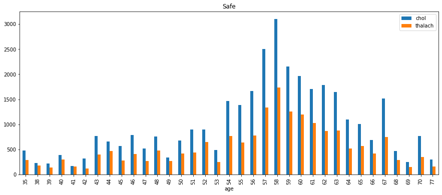
Age group - Safe
- First group the data (
df_0) byageconsidering the columnscholandthalach.
ag_df_0 = df_0.groupby(by=['age'])[['chol', 'thalach']].sum()
- Plot a
barchart for the grouped data (above).
ag_df_0.plot(kind='bar', figsize=(15, 6), title='Safe')
plt.show()
The plot looks like this -
Conclusion
People who are in the risky group have high heartbeat rates compared with those who are in the safe group.
Also, the cholesterol measurements are higher in the risky group
One can easily assume that optimal heartbeat rate is a goal for heart patients in order to be healthy - clearly understood from the graphs.
Let's plot the [chol , thalach] features with respect to cp (chest pain) for both df_1 and df_0.
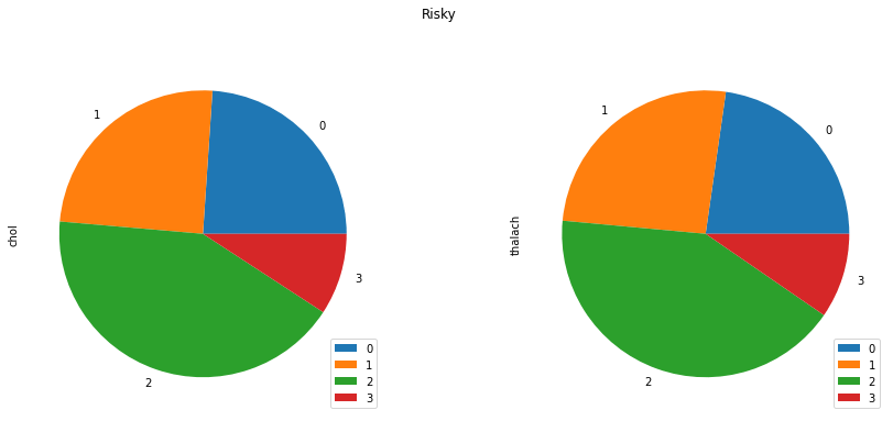
CP group - Risky
- First group the data (
df_1) bycpconsidering the columnscholandthalach.
cp_df_1 = df_1.groupby(by=['cp'])[['chol', 'thalach']].sum()
- Plot a
piechart for the grouped data (above).
cp_df_1.plot(kind='pie', figsize=(15, 6), subplots=True, title='Risky')
plt.show()
The plot looks like this -
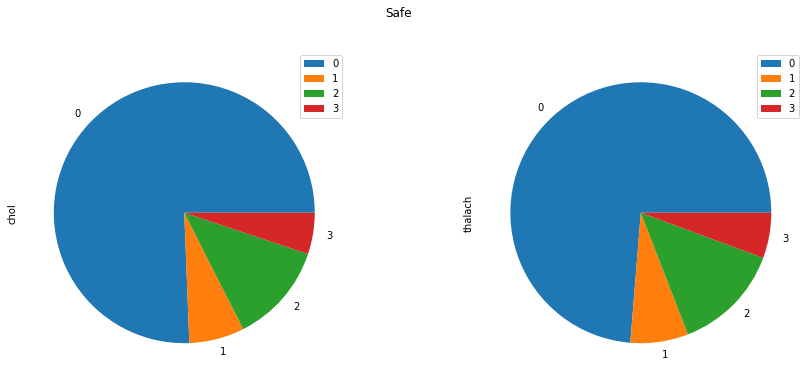
CP group - Safe
- First group the data (
df_0) bycpconsidering the columnscholandthalach.
cp_df_0 = df_0.groupby(by=['cp'])[['chol', 'thalach']].sum()
- Plot a
piechart for the grouped data (above).
cp_df_0.plot(kind='pie', figsize=(15, 6), subplots=True, title='Safe')
plt.show()
The plot looks like this -
Conclusion
From the above two graphs, we can observe that safe category people have lesser degrees of chest pain than the risky.
It also very significant that
cpandthalachboth are equally important with respect to theageof the patient.
Scatter Plot of age and cp
Scatter Plot helps us identify an upward trend or downward trend for two variables that are taken. It is just another form of correlation represented graphically. Based on two datasets df_1 and df_0, let's compare cp with respect to age.
plt.figure(figsize=(10, 6))

plt.scatter(df_1['age'], df_1['cp'], label='Risky')
plt.scatter(df_0['age'], df_0['cp'], label='Safe')
plt.xlabel('age')
plt.ylabel('chest pain')
plt.legend()

plt.show()
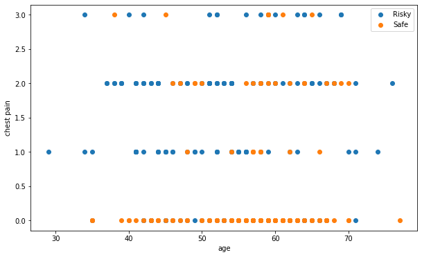
Conclusion
From the plot, we can see that most of the safe category people have a lesser degree of chest pain than those of risky people.
In the safe category, though the age is more, the chest pain degree is less and of course there are others who have a high degree.
Scatter Plot of age and thalach
Now, let's compare thalach with respect to age for both df_1 and df_0.
plt.figure(figsize=(10, 6))

plt.scatter(df_1['age'], df_1['thalach'], label='Risky')
plt.scatter(df_0['age'], df_0['thalach'], label='Safe')
plt.xlabel('age')
plt.ylabel('thalach')
plt.legend()

plt.show()
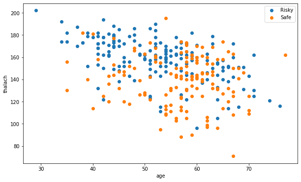
Conclusion
If we just observe the safe (orange) category, the heartbeat level is constant with respect to age.
The same is not with the risky (blue) category.
We can also assume that people in the group between 29 to 60, have higher rates that lead to an attack with adding higher degrees of chest pain.
Well, that's all for now. This article is included in the series Exploratory Data Analysis, where I share tips and tutorials helpful to get started. We will learn step-by-step how to explore and analyze the data. As a pre-condition, knowing the fundamentals of programming would be helpful. The link to this series can be found here.